Floresi Floral Atelier
Visual Identity Design
CREATIVE STRATEGY
CREATIVE DIRECTION
VISUAL IDENTITY DESIGN
NAME IDEATION
TAGLINE DEVELOPMENT
Crafting a visual identity to reflect the brand's artistic and premium positioning.
We developed a visual identity that balances contemporary sophistication with playful opulence. Drawing inspiration from Baroque decorative arts, it achieves a striking contemporary feel while retaining a heritage tone, reflecting the brand's premium offering and artistic, modern design approach.
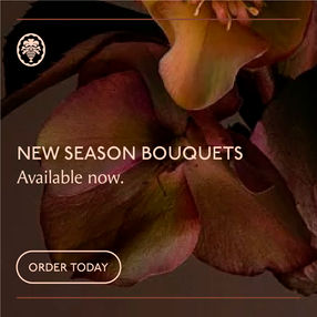
The logomark features curvaceous script lettering with a bold, stylised overflowing vase, mirroring the organic forms of flowers and foliage. Moody, artistic photography and romantic colour palette cultivate an air of sophisticated elegance.
This refined aesthetic establishes a luxurious and captivating presence, perfectly positioning the brand within the boutique premium market and appealing to those seeking an elevated craft in floral artistry.


A colour palette of warm, rich hues, interwoven with soft, romantic tones, cultivates an air of sophisticated elegance. Representing the natural beauty of flowers and establishes a luxurious, inviting brand atmosphere.
The wordmark features curvaceous script lettering, exuding both elegance and playfulness. Its flowing, organic forms mirror the natural contours of flowers and foliage, creating a visually harmonious connection to the brand's services. The brand symbol represents an overflowing Baroque style vase, styled to echo the wordmark's fluid curves. The elements are both classic and contemporary, serving as a versatile and instantly recognisable logo for branding, packaging, and signage.
Evocative, artistic photography, showcasing close-up shots of flowers and natural elements, is paired with graphic elements that subtly nod to vintage Baroque aesthetics, with fluid curves and ornate frames. This reinforces the brand's premium and artistic positioning. The overall aesthetic achieves a balance of luxurious sophistication and playful invitation. The design's classic yet contemporary nature perfectly reflects the brand's boutique premium position, appealing to an audience that seeks an elevated craft in floral artistry.


