Preshil
Brand Identity
CREATIVE DIRECTION
IDENTITY DESIGN
VISUAL LANGUAGE DEVELOPMENT
LOGO DESIGN
STYLE GUIDE
WEBSITE DESIGN DIRECTION
BRAND COLLATERAL DESIGN
Client: Preshil
Agency: Portable
Cass Eddy: Creative Direction, Graphic Design
Joe Sciglitano (Portable): Project Lead, Brand Positioning
Alice Reeve (Portable): Senior Digital Producer
Made for Originals:
A brave new identity for Preshil
Preshil is one of Australia's oldest progressive schools, built on nearly a century of doing education differently. It had recently developed a bold new position, "Made for Originals," and a sharper, more confident tone of voice.
Preshil was ready to bring it all to life visually: to build a visual language that carried that new confidence, while still honouring the heritage the community already trusted.


The Approach
Starting with community.
Before any design work started, we facilitated a series of workshops to get stakeholders from across the school aligned on direction, interrogating what the identity needed to protect, what was genuinely open to change, and what 'Made for Originals' should actually feel like. Those conversations set the principles we designed with: authentic over polished, confident enough to stand without leaning on the logo everywhere, and rooted in real individuality rather than a generic 'quality school' look.


Creative Direction
The thinking behind the visual language kept returning to one idea. Most high-fee schools lean into polish and prestige. Preshil's philosophy is the opposite — progressive, exploratory, authentically honest, a little rough around the edges by design. The ‘Made for Originals’ expression needed to echo that sentiment with a sense of confidence.
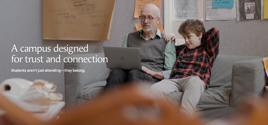
The Preshil visual style prioritises authenticity: a textures library built from student creations and images of Preshil's own environments. The photography direction favours candid, unposed learning experiences over styled portraiture. Nothing about it was designed to look manicured; it was designed to look real.


Evolve, redesign or replace.
The soaring eagle at the centre of Preshil's existing mark was the biggest open question of the whole project. Nobody was certain whether to evolve it, replace it, or leave it alone. So rather than pitching one answer, we explored a full range of what that evolution could look like — from a cleaner, simplified silhouette to a loosely hand-drawn version, alongside a resurrection of found history: an original handwritten ‘Preshil’ from the founder Margaret ‘Greta’ Lyttle.
Instead of settling on a direction internally, Preshil put three options in front of its own community and asked. The results provided clarity and informed a strategy: keep the eagle instantly recognisable, update it to embody the spirit of the brand, and let explorative creativity live in the details around it.
To bring the recognisable eagle into a new era, we refined its soaring character and flowing qualities, paired with a bespoke serif wordmark, balancing creative character with functional clarity. A symbol of the intellectual freedom and independence fostered within the community, its upward flight reflects a commitment to nurturing students to ‘soar high’ as courageous, self-directed thinkers.

Making it work together
Beyond developing a completely new Visual Style Guide, I also delivered a set of website design examples, giving Preshil's web development team a clear, prioritised direction to carry into the school's new website development.
An original handwritten ‘Preshil’ found its place too, as an honorary supporting mark, a historic artefact connecting the contemporary brand back to its founder almost a century ago.
The result
A visual identity for Preshil that the community and place had a hand in shaping, built on evidence rather than opinion, and true to a school that has never done things the standard way.